Building a CMS for content at Trade Me
Overview
Content at Trade Me was treated as an afterthought. Teams across the business were producing guides, news, and reviews using disconnected systems, with no shared strategy and often starting from what the business already knew, rather than what customers needed to know to make informed decisions on their purchases. There was no single view of what "good content" looked like, no reusable components, and no way to measure whether any of it worked.
I led design on a new CMS meant to fix that by connecting customers with content that actually helps them buy, sell, or list, while giving Trade Me's business units a shared, scalable way to produce it.
My contribution
End-to-end product design Research Accessibility
The team
1 × Sr Product Designer 1 × Sr Product Manager 3 × Engineers
Year
2020
Process
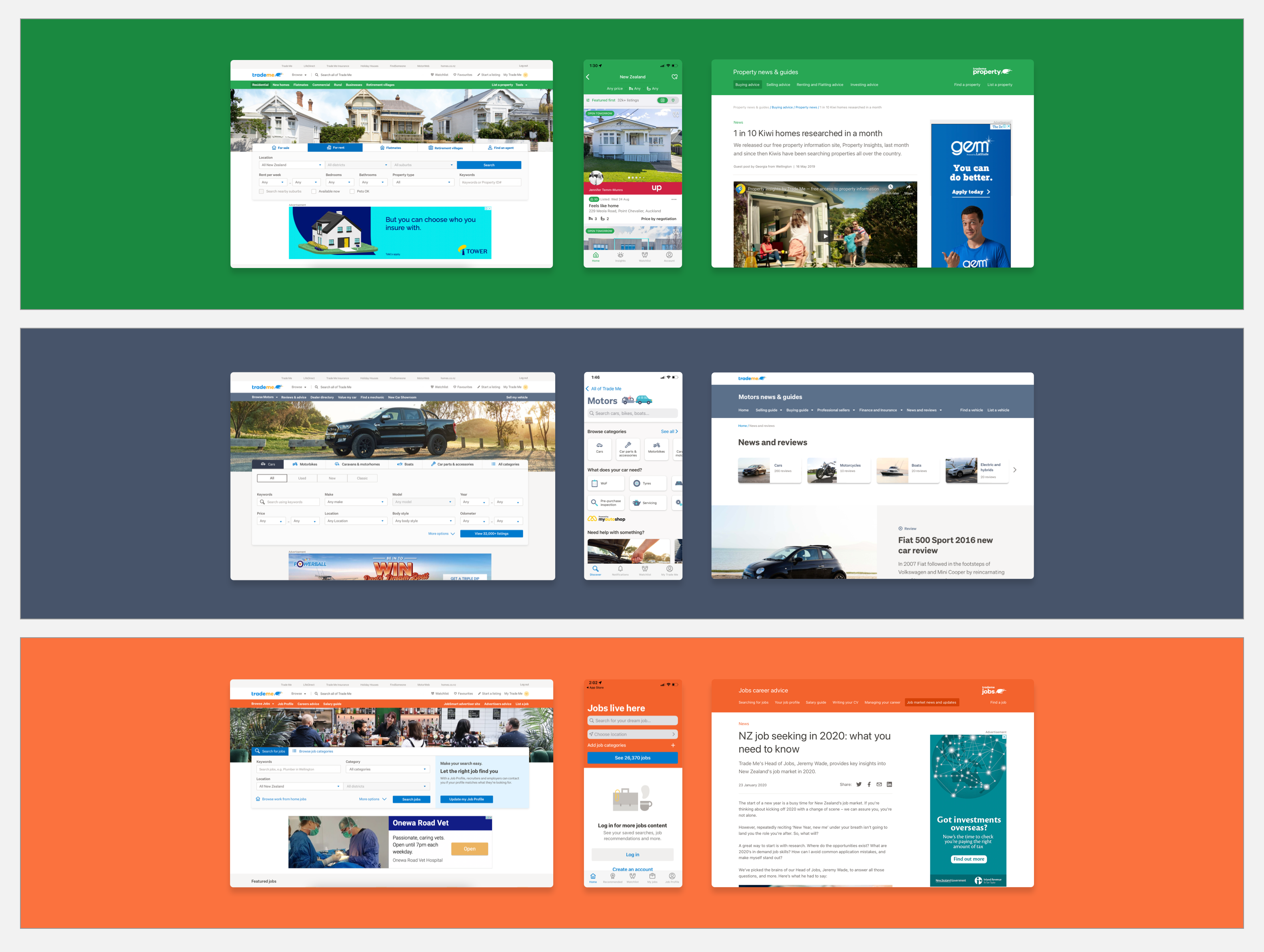
Trade Me has 4 very separate business units: Property, Motors, Marketplace and Jobs. They have their own teams and priorities, and work relatively independent from each other. So our biggest challenge with this project ended up not being the design itself, but this lack of alignment across the business's units. Each had different content needs, different branding conventions, and different stakeholders who had been creating their own content without much constraint or guidance before.
Any solution that worked for one business unit and not the others would just recreate the fragmentation we were trying to solve, so we knew we had to design one system flexible enough to serve four different businesses, without a large team to build four different things.
Research
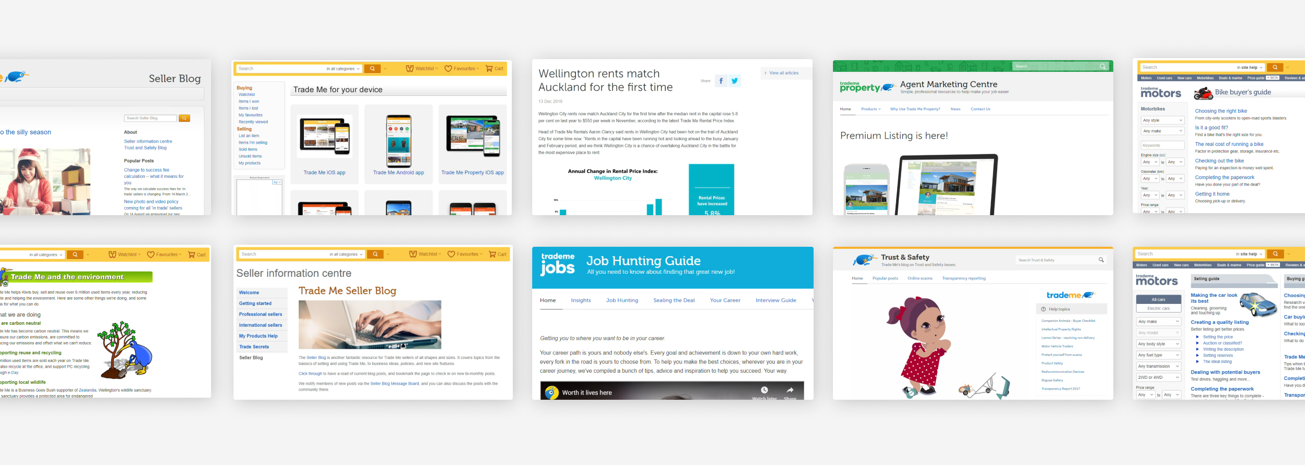
Working with our UX researchers, we started from the customer, not the business. Talking to members surfaced something the business hadn't realised, which is that Trade Me actually had genuinely useful content (guides, insights, news), but members didn't know it existed, and couldn't find it when they went looking.
We ran tree testing and card sorting to understand how members expected content to be organised and named, which gave us our first real information architecture, which was grounded in how customers think.
Design decisions
I set three constraints early, because I knew they'd force the right trade-offs later:
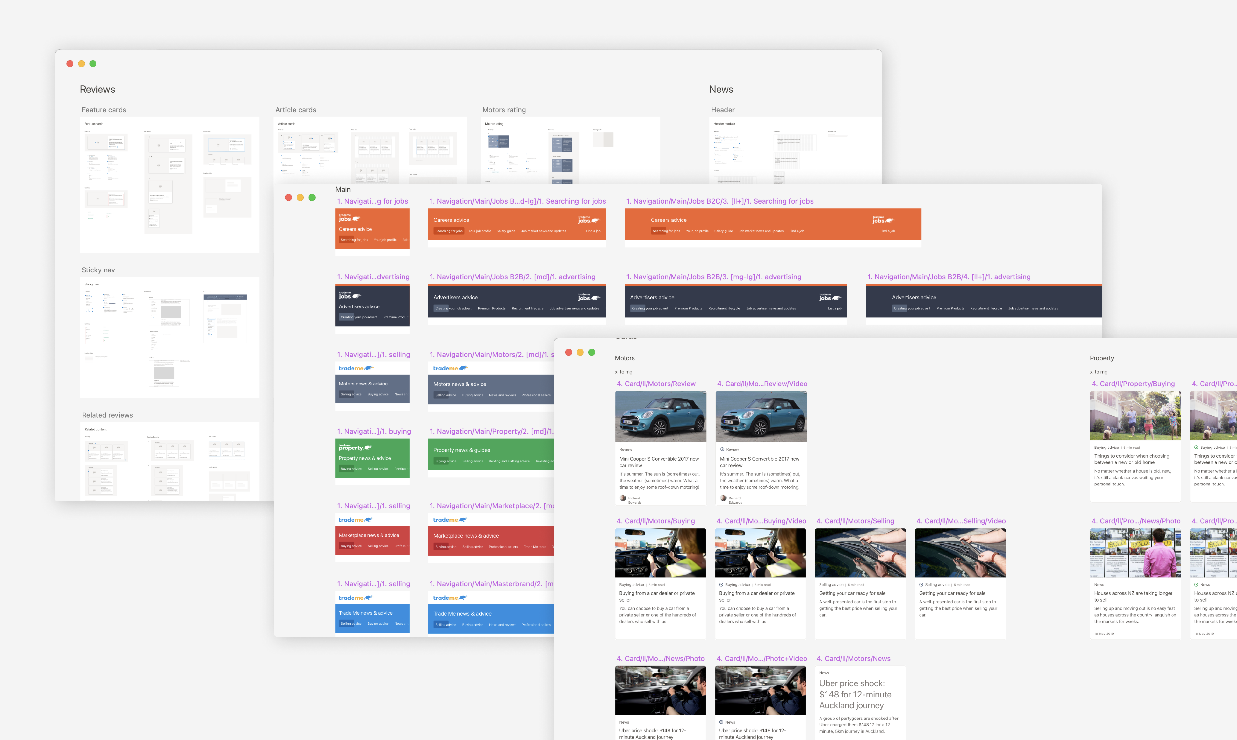
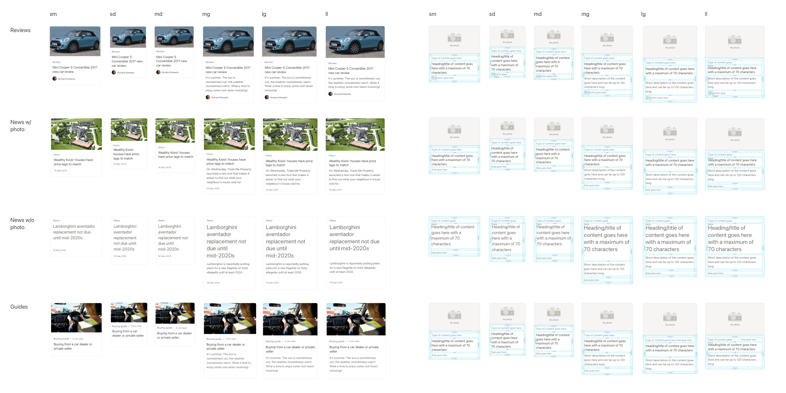
• Design once, reuse everywhere. Instead of building screens, I designed a library of modular content components (cards, headers) that could be assembled differently depending on content type and business unit, but never redesigned from scratch.
• Responsive by default. Every module had to hold up across breakpoints while preserving the information that actually mattered to a decision. For example, always showing the date on news, reading time on guides, and author credibility on reviews, regardless of screen size.
• Consistent within a business unit, not across all of Trade Me. Each vertical has its own brand conventions. Rather than forcing one visual identity across all four, I optimised for a cohesive experience within a customer's journey through a single business unit. This was a decision that some stakeholders initially pushed back on, but that held up as verticals scaled independently.
I wrote and shared documentation for every module: when to use it, and what accessibility practice applied to it, so the system would be scalable and designers could use it independently.
Cross-functional leadership
I ran weekly alignment meetings across design, marketing, and product, and led co-design workshops with communications and product designers from each business unit to map the full customer journey — from marketing email or homepage, through content, and back to a purchase decision. I also delivered training in Auckland and Wellington to the content creators who'd be using the system day to day, walking them through both the mechanics and the underlying content principles, so adoption didn't depend on me being available to answer questions.
Rollout strategy
We launched with one business unit first as a trial. The idea was to prove the framework held up under real content teams and real customer behaviour before asking the rest of the business to adopt it.
Outcome
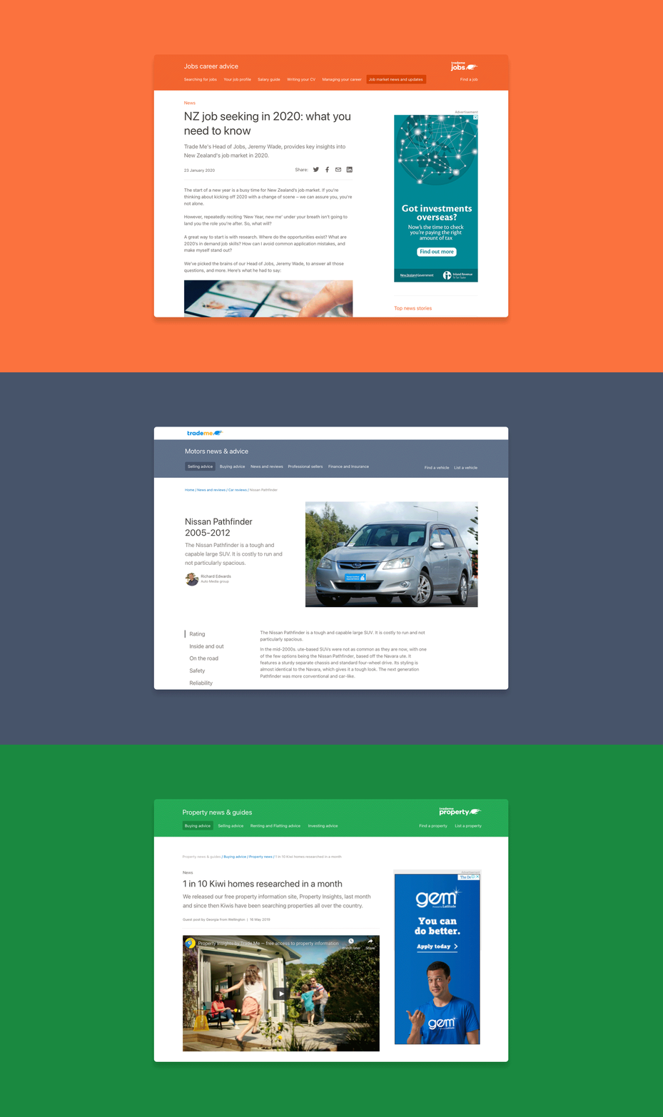
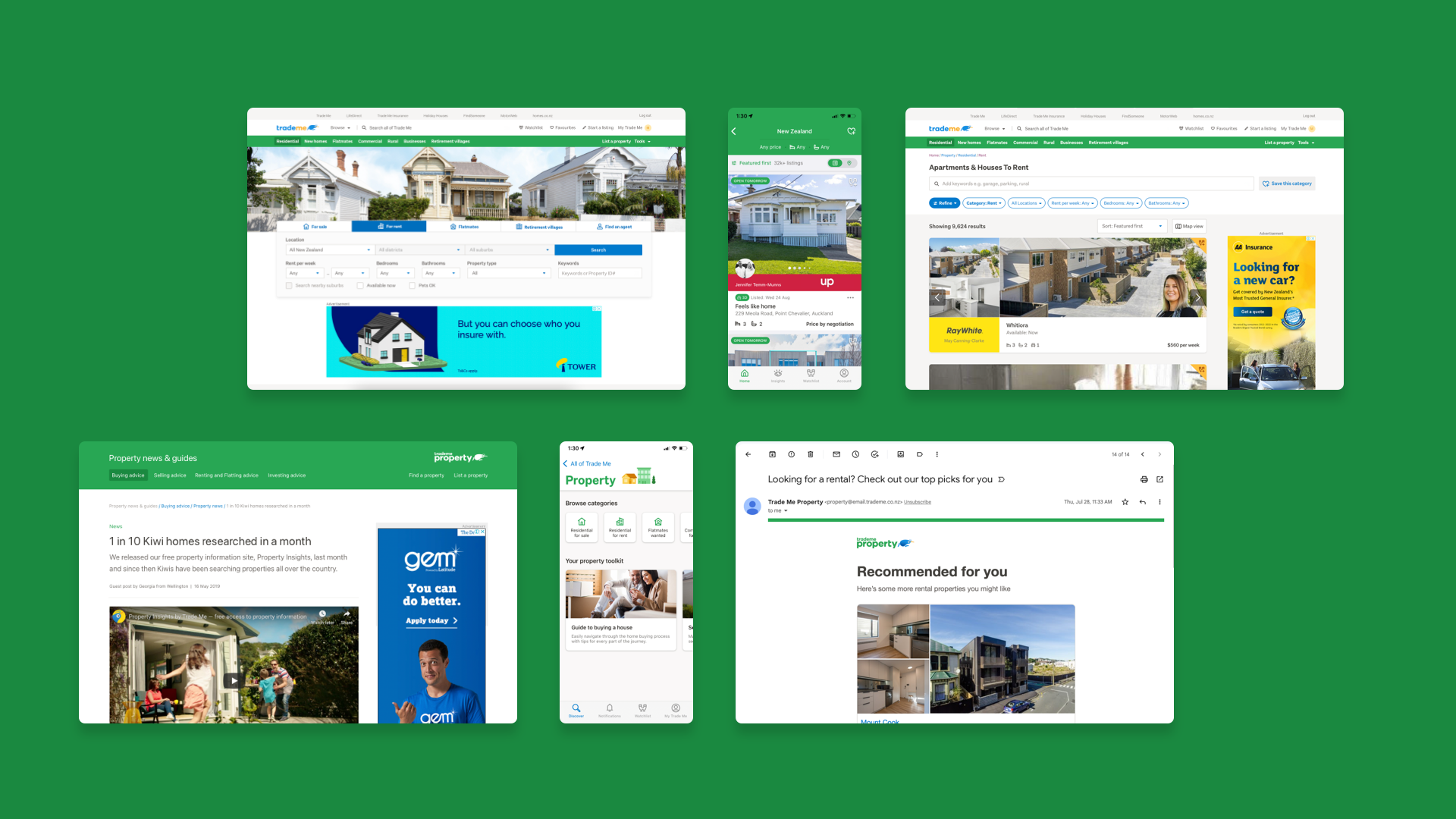
I left Trade Me before the full rollout was complete, so I don't have the traffic or conversion data from that period. What I can point to is that the CMS is live in production and has scaled to all four verticals (Property, Motors, Marketplace, and Jobs) each running the same content architecture we designed as reusable modules from the start: dated news, guides with reading time, and reviews with visible author attribution.
That's the outcome that matters most to me from this project. The framework scaled on its own logic, across a business that had never previously agreed on how to do content, which is the actual test of whether a system-level design decision was right.