Evolving Xero's design system
Overview
Over the years of growth, Xero's design system (XUI) had accumulated inconsistencies. We had different patterns, solving the same problems, in different ways, across different parts of the interface. In 2024, the design team decided to address this in a systematic way.
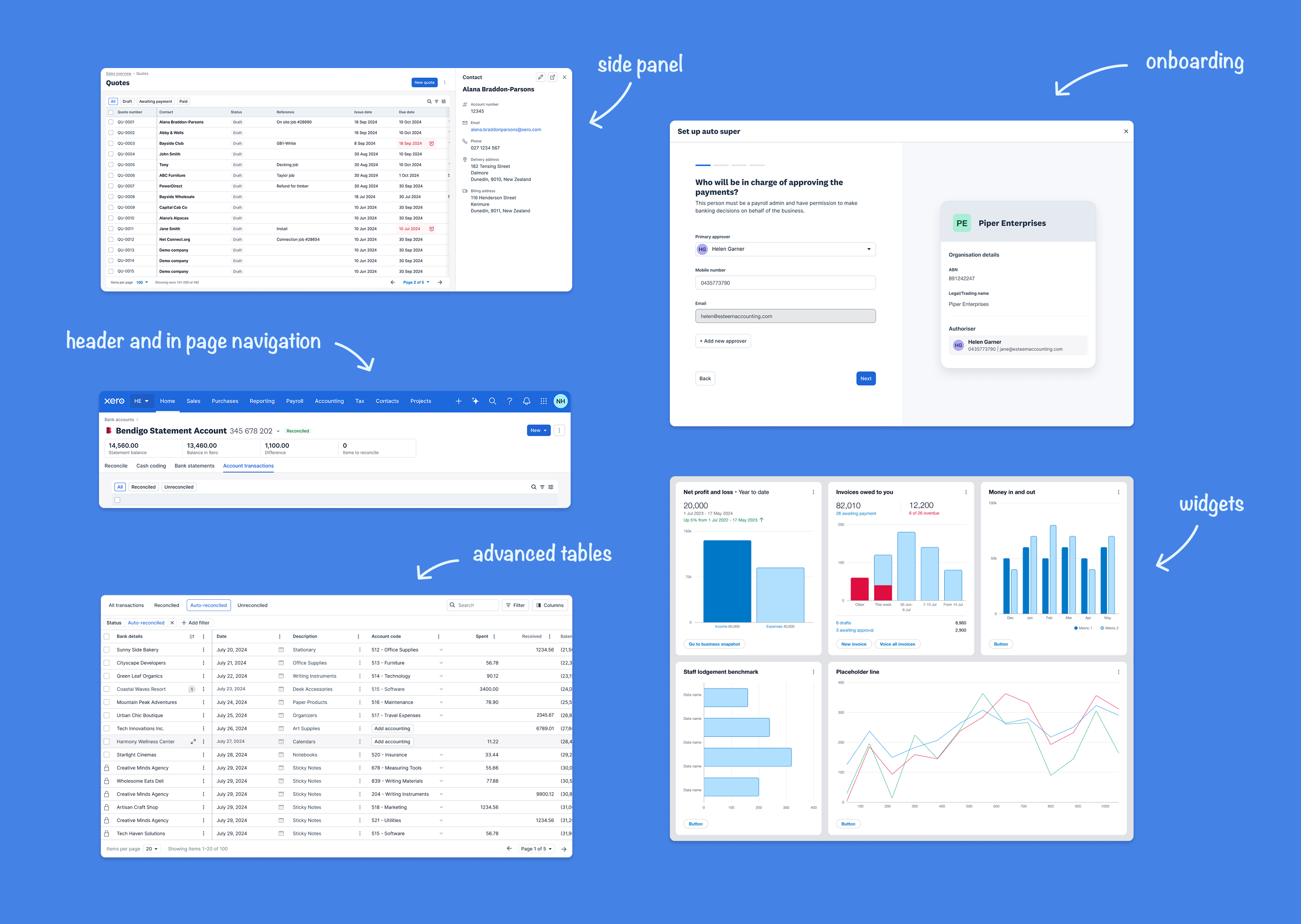
In 2024, in and effort to create a consistent and robust platform, the systems team identified the eight UI patterns that account for 80% of the Xero interface, formed eight virtual teams to redesign each one, and set a clear goal: a unified, accessible system that would improve quality, accelerate delivery, and give teams a consistent way of working.
My contribution
Accessibility leadership and guidance to the 8 teams
The team
1 x Accessibility Lead 8 x Virtual teams, with 3 Designers each 5 x Design systems designers
Year
2024
Process
Planning
I joined the project as the sole Accessibility Lead, supporting all eight teams simultaneously.
My first step was to consider and plan for was how to manage the work. We had eight concurrent teams working on different pattern areas and different timelines, each moving at a very fast pace. And one of the key requirements was that accessibility was integrated meaningfully across all of them.
When drafting my approach, my first instinct was to triage: identify the highest-risk patterns and focus there. But I quickly realised this would mean accepting that some patterns would be built without accessibility considerations, which would mean the design system would have exclusion baked into its foundations — the opposite of what I wanted.
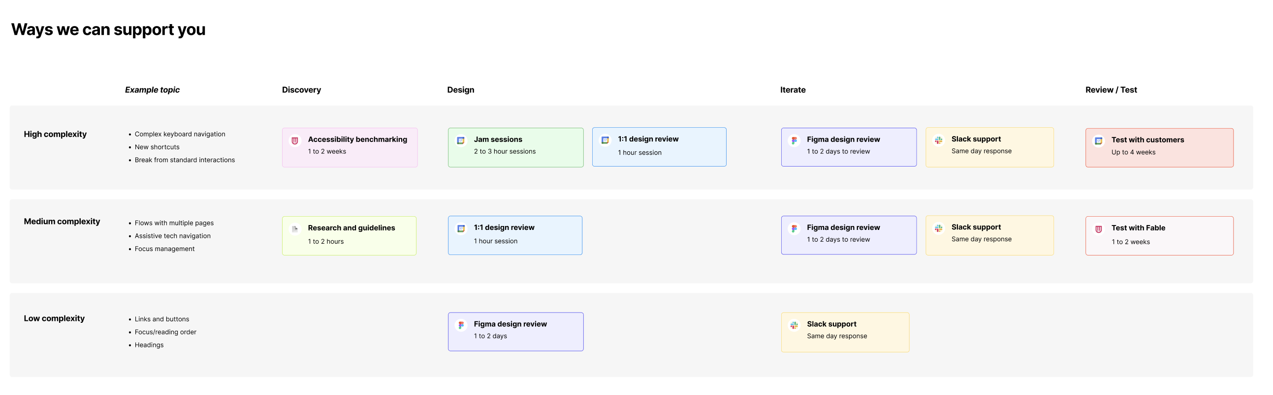
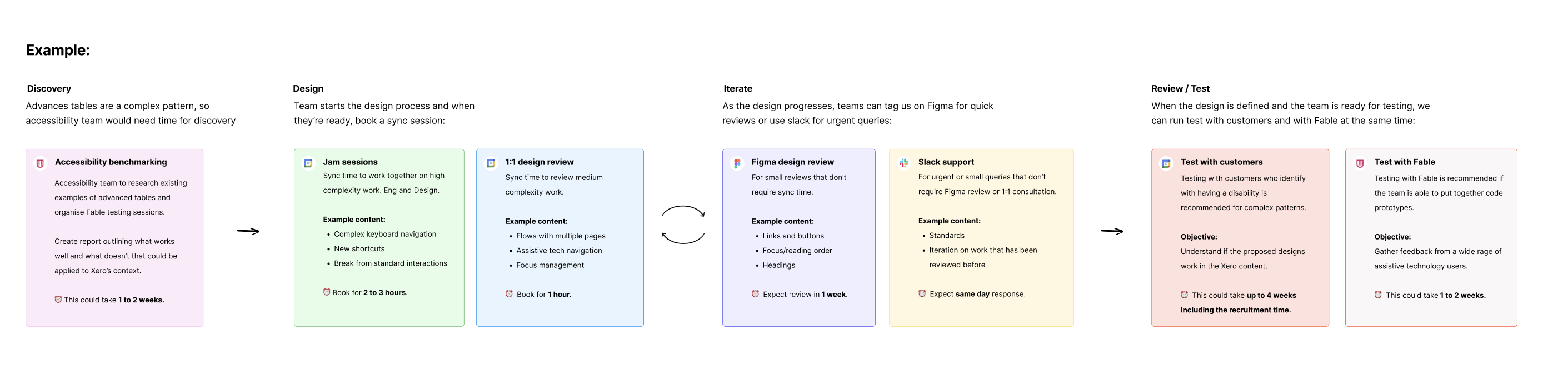
After a bit of back and forth with my manager at the time, we ended up building a scalable engagement model that defined how collaboration would work across all eight teams from the start. This model specified how much time I could dedicate to each team, what accessibility integration would look like at each phase of their process, and how decisions would be made when accessibility requirements created tension with other constraints. It would work for us as a governance framework — a way to make the collaboration sustainable and consistent without requiring more resources than already exist.
What the work actually involved
From August 2024 to March 2025, I met with each virtual team for 30-minute to 1-hour co-design working sessions every week.
The work varied significantly across patterns. Some patterns raised straightforward questions about colour contrast, focus states, and touch target sizes. Others raised harder questions about how assistive technology users perceive and navigate complex interactions, which required us to think carefully about DOM structure, focus management, and the way screen readers announce dynamic content changes.
My work followed the same path as the designers: discovery, design, delivery, documentation.
Discovery
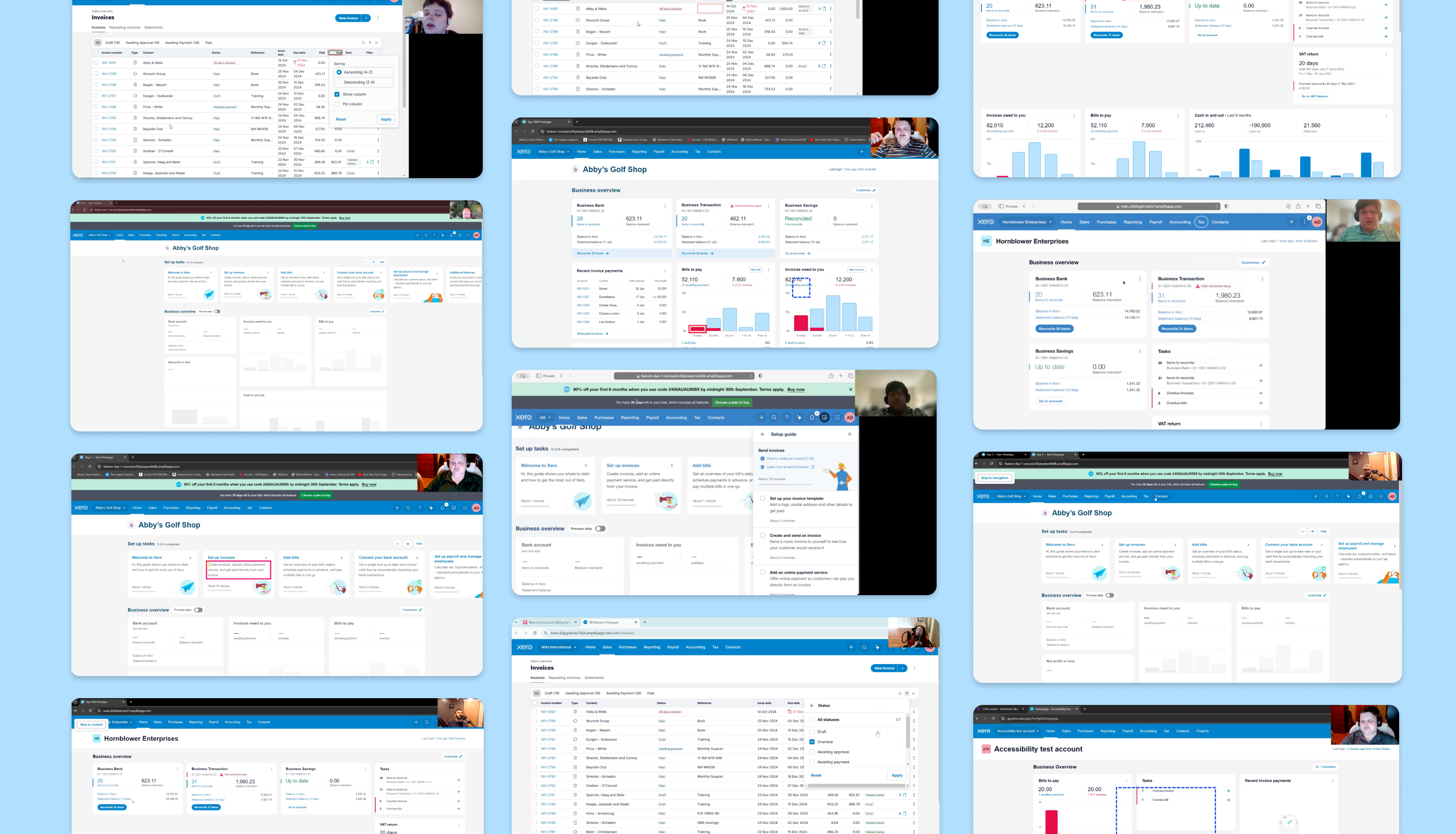
The discovery phase involved finding similar patterns on other websites and testing them. I would do a first test myself, and if there was something that didn't feel well defined, I'd take it to user testing (via Fable). Testing existing patterns from other websites was a great way for us to start defining what works and what doesn't.
Design and delivery
From this stage on, I moved into my consulting role, attending the meetings to support with any questions and doing additional user testing as needed. The teams started building coded prototypes that I could take to testing, and we would tweak the flows and components from there.
Much of my role in those sessions was a sort of translation — making the experience of navigating with a screen reader or keyboard legible to designers who didn't have experience thinking about it before.
Documentation
Upon completing the collaborative design phase, the refined patterns were handed to the Design Systems team for final technical refinement, documentation, and formal endorsement by design leadership.
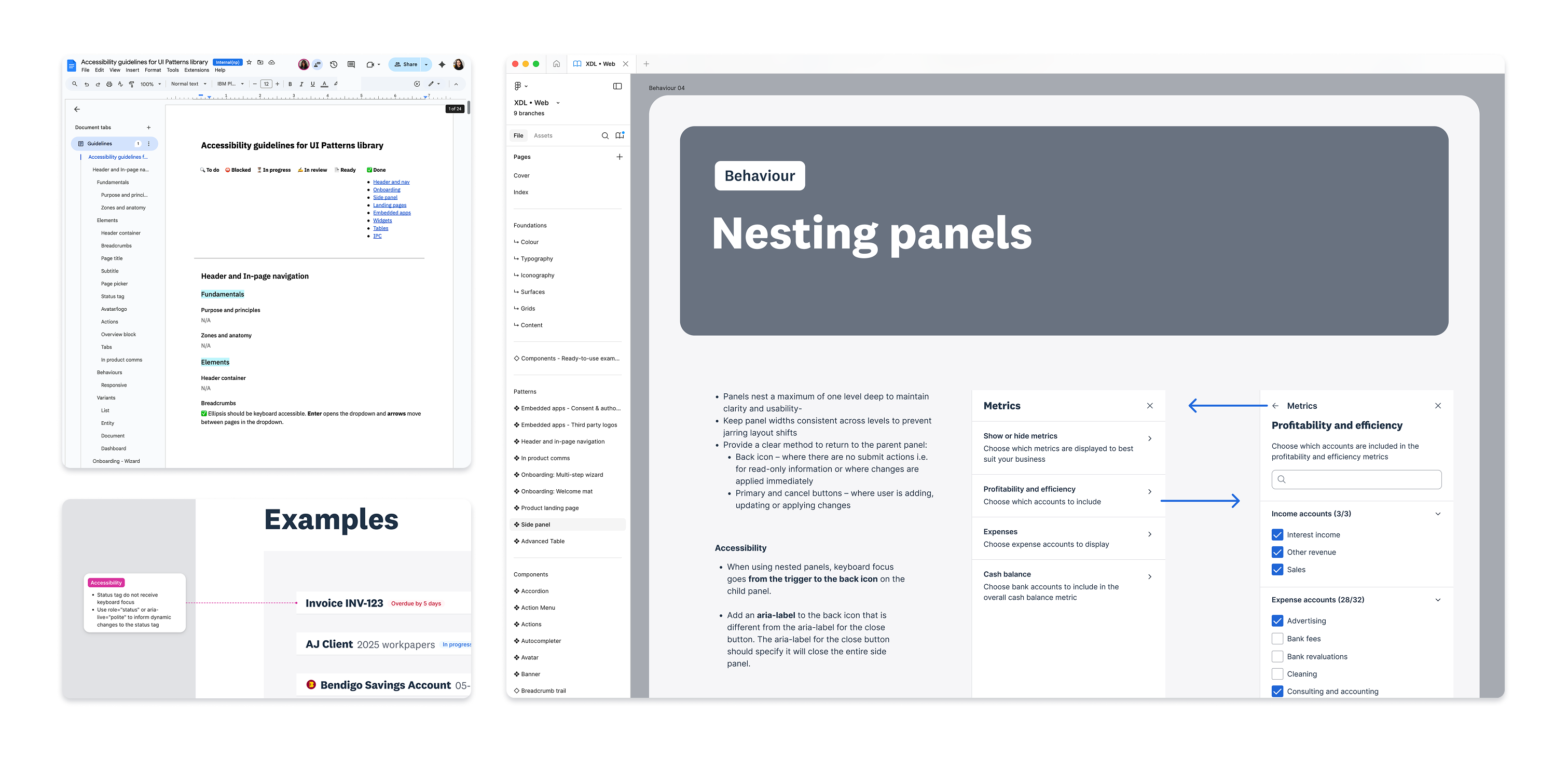
The last step was developing comprehensive, design-focused accessibility guidance for each pattern. I met with 8 designers of different seniority levels to understand where the documentation should live. I had three main options: contextual to the element of the pattern, at a pattern level, and outside of Figma, in a documentation space.
The majority preferred it contextual, as that would mean they would have everything they needed right there. So this is what we did: we embedded the guidance directly in the Figma libraries alongside the visual components so that accessibility guidance and design components were inseparable from the moment a designer picked them up.
Outcome
Every team using the XUI now starts from a higher baseline of accessibility and consistency, rather than reinventing solutions. We have no new accessibility issues being introduced and a structured remediation path for existing XUI components instead of scattered fixes.